Could On-site Excel Training The Best Solutions For Your Organisation?
Excel Chart in a Dashboard Report
Screenshots of the Dashboard
Features in the Excel Dashboard
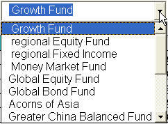
1. The Excel Chart dashboard contains a dropdown box that allow you to click and select the fund you wish to review.Enter your text here…
2. A table that displays the profitability of the fund for the last 2 years. The table will show a green arrow if the variance make a positive contribution to profit for this year compared to last year.
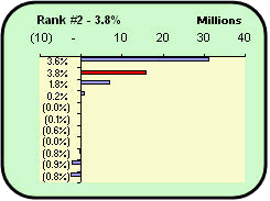
3. The graph on the fund ranking are automatically arranged in descending order and it will highlight the bar representing the selected fund in red. In case the bar is too short, the top left hand corner of the graph will display the rank and the rate of return (profit only) of the fund.
4. The second graph will display the income and profit trend of the selected fund for the last 5 years. The y axis will auomatically switched in denomination from thousands to millions when the values in the graph cross the half a million mark.
5. Finally, you can easily add more funds for comparison just by filling in the details in the next empty column all the way to column Z.
If you wish to see this Unit Trust Dashboard in action, complete the form below and have it send your inbox Now!
[thrive_lead_lock id=’2901′]Hidden Content[/thrive_lead_lock]
New! Comments
Have your say about what you just read! Leave me a comment in the box below.
Share this page:
Enjoy this page? Please pay it forward. Here’s how…
Would you prefer to share this page with others by linking to it?
- Click on the HTML link code below.
- Copy and paste it, adding a note of your own, into your blog, a Web page, forums, a blog comment, your Facebook account, or anywhere that someone would find this page valuable.
<a href=”http://www.advanced-excel.com/”>Advanced Excel – From a Business Perspective</a><a href=”http://www.advanced-excel.com/”>Advanced Excel – From a Business Perspective</a>

Excel Courses for Business Professionals
Copyright © advanced-excel.com 2007 – 2019. All Rights Reserved. Privacy Policy
Microsoft® and Microsoft Excel® are registered trademarks of Microsoft Corporation.
advanced-excel.com is in no way associated with Microsoft


